Summary to Details Dashboard
This dashboard gives a snapshot of license usage, denials, and efficiency across applications. It helps identify priority areas at a glance, then dives into detailed, user-level data for deeper analysis.
The dashboard includes four sub-dashboards that include various charts that visualize specific data for deeper analysis.
Dashboard Generation
To generate the dashboard, follow these instructions:
-
Set the following filters based on your specific requirements:
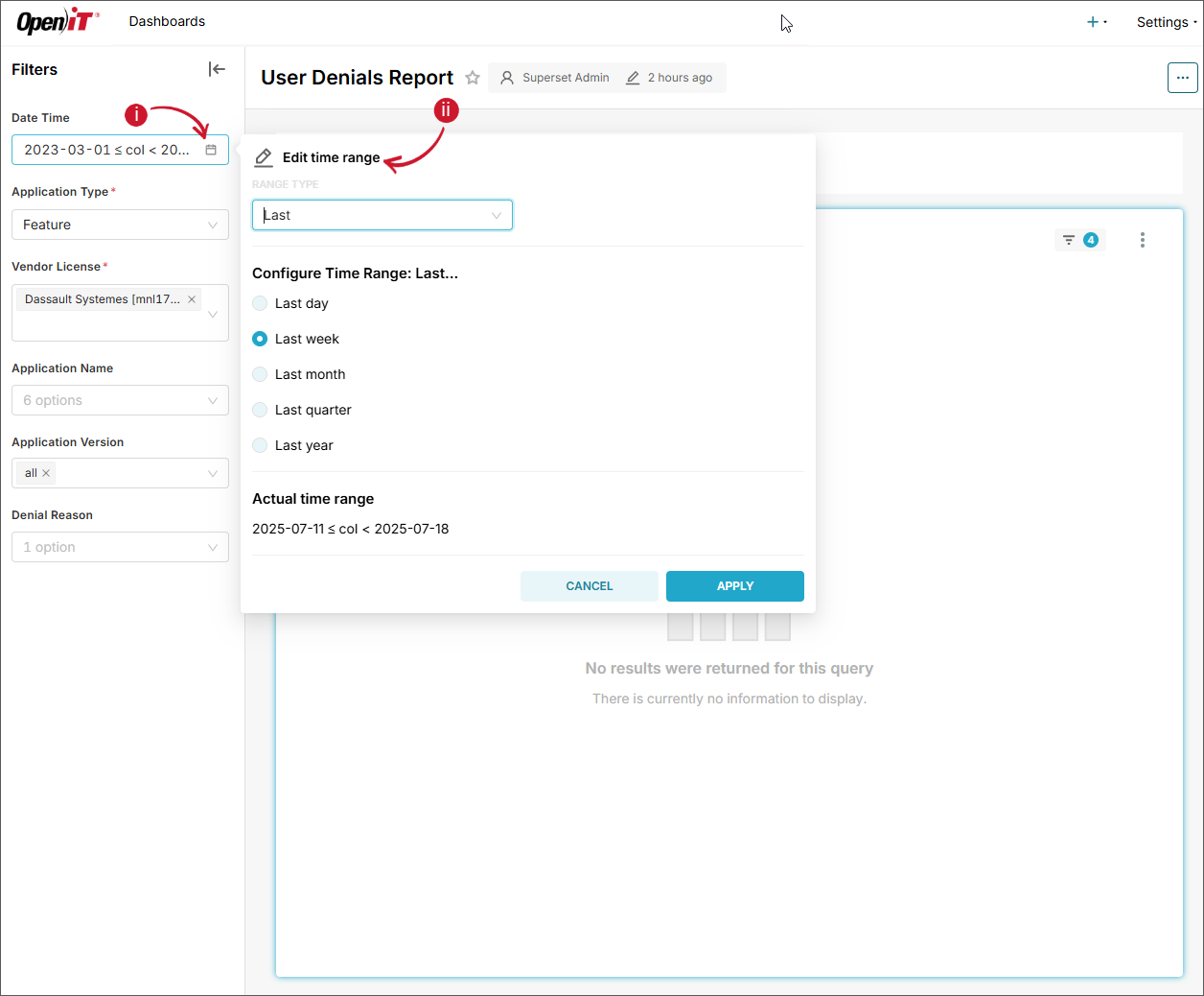
a. Date Time - date range that will be included in fetching the data. This is set as default to Custom (start – 2023-03-02 00:00:00 and end – 2023-03-01 00:00:00). To configure:
- Click the calendar icon located in the left side of the filter. The Edit time range will be displayed.
- Choose among the available Range Type.
-
When Last is selected, select among the predefined time ranges:
- Last day
- Last week
- Last month
- Last quarter
- Last year
 Date Time - Last
-
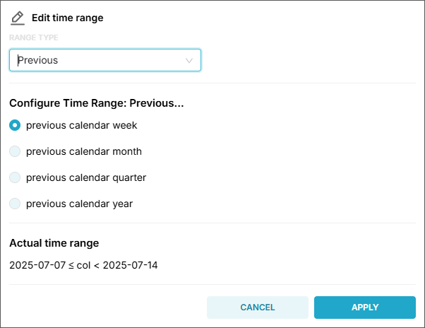
When Previous is selected, select among the predefined time ranges:
- previous calendar week
- previous calendar month
- previous calendar quarter
- previous calendar year
 Date Time - Previous
-
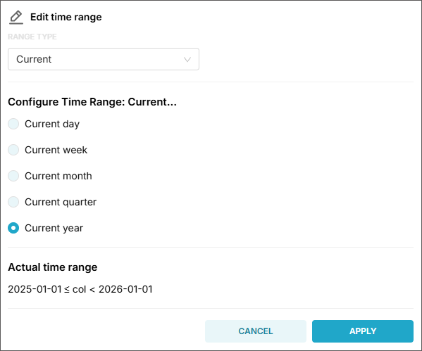
When Current is selected, select among the predefined time ranges:
- Current day
- Current week
- Current month
- Current quarter
- Current year
 Date Time - Current
-
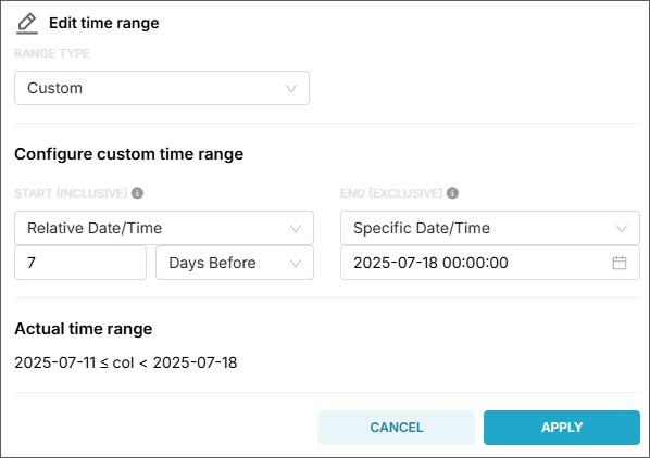
When Custom is selected, configure the following information:
- Start (inclusive) - choose among the available options (Now, Specific Date/Time, Relative Date/Time, and Midnight)
- End (exclusive) - choose among the available options (Now, Specific Date/Time, Relative Date/Time, and Midnight)
 Date Time - Custom
tipSuppose you have a time range:
- Start: 2025-07-01 00:00:00
- End: 2025-07-02 00:00:00
This range includes all timestamps starting 2025-07-01 00:00:00, up to but not including 2025-07-02 00:00:00.
So:
✅ 2025-07-01 00:00:00 - included
✅ 2025-07-01 23:59:59 - included
❌ 2025-07-02 00:00:00 - not included -
When Advanced is selected, provide the following information:
- Start (inclusive) - it can be
YYYY,YYYY-MM,YYYY-MM-DD,YYYY-MM-DD HH,YYYY-MM-DD HH:MM, orYYYY-MM-DD HH:MM:SS. - End (exclusive) - it can be
YYYY,YYYY-MM,YYYY-MM-DD,YYYY-MM-DD HH,YYYY-MM-DD HH:MM, orYYYY-MM-DD HH:MM:SS.
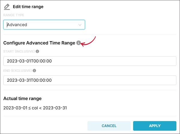 Date Time - Advanced
tipHover the information icon beside Configure Advanced Time Range for examples and guides in setting time ranges.
- Start (inclusive) - it can be
-
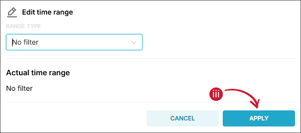
When No filter is selected, all available data will be included in fetching.
 Date Time - No Filter
- Click Apply.
tipUse the Actual time range as a reference when validating the settings.
b. Application Type (required) - name of the grouping in which data types are classified, such as Feature, Handle, and Package.
NOTEThere are other optional filter parameters that you can set, such as Vendor License, Application Name, Application Version, and Denial Reason. However, it is recommended to use table item selection as the preferred method for filtering, as it aligns best with the dashboard’s interactive design and ensures smoother user experience.
-
Click Apply filters.
Wait until the report has finished processing and is displayed.
Filtering using Table Items
Once the dashboard is generated, you can begin interacting with the charts and visualizations. Each sub-dashboard contains interconnected charts, each designed to serve a specific analytical purpose. These charts are synchronized — applying a filter to one will automatically update the data displayed in the others. This dynamic interaction allows for progressively deeper insights as users explore different data segments.
Tables are the primary method for applying filters across the dashboard. By clicking on an item within a table, you trigger a filter that applies to the entire dashboard.
To apply a filter:
-
In each sub-dashboard, you will find four filterable tables:
- Vendor License Overview
- License Usage Overview
- Denial by Reason
- User Denial
Click on a specific item within any of these tables to apply a filter.
NOTE- Only classification-level items can be selected.
- Only single selections are allowed.
- You can use the search bar within each table to quickly locate specific items.
-
Once an item is selected, all related charts across all sub-dashboards will automatically update to reflect the filtered data, ensuring a cohesive and relevant analytical view.
Available Sub-dashboards
License Overview
This is the main sub-dashboard when navigating the Summary to Details dashboard. It gives you an overview of license utilization from vendor license down to specific applications.
Vendor License Overview
A table showing the maximum license utilization and total number of license checkout denials.
The report includes the following classification and measurements:
Classifications
| Classification | Description |
|---|---|
| Vendor License | License server together with the vendor name hosting the licenses |
Measurements
| Measurement | Description |
|---|---|
| Max Utilization | Maximum license utilization of the vendor license, computed as the maximum concurrent licenses divided by the maximum available number of licenses |
| Denials | Total summation of license checkout denials |
License Usage Overview
A table showing the license usage and denials of a list of features or applications.
The report includes the following classification and measures:
Classifications
| Classification | Description |
|---|---|
| Application Name | Name of the licensed application |
Measurements
| Measurement | Description |
|---|---|
| Max Available | Maximum number of available licenses |
| Max In Use | Maximum number of concurrent licenses used by the user |
| Denials | Total summation of license checkout denials |
License Utilization Trend
A chart displaying daily license usage and denials over the selected time range.
The report includes the following measurements:
Measurements
| Measurement | Description |
|---|---|
| Max Available | Maximum number of available licenses |
| Max In Use | Maximum number of concurrent licenses used by the user |
| Denials | Total summation of license checkout denials |
If no filters are selected, the values will be calculated across all applications as follows:
Measurements Computation
| Measurement | Description |
|---|---|
| Max Available | Displays the highest number of licenses available among all applications |
| Max In Use | Displays the highest number of licenses in use among all applications |
| Denials | Shows the total number of license checkout denials across all applications |
License Efficiency
This sub-dashboard highlights how licenses are being utilized and assesses the effectiveness of their use.
Max in Use vs Max Available
A table providing the values for both the maximum available licenses and the peak number of licenses in use, as determined by the selected filters.
License Efficiency Report
A chart that provides insights into how software licenses are utilized over time.
It includes the following key metrics:
Measurements
| Measurement | Description |
|---|---|
| Used Licenses | The number of licenses actively in use during the reporting period |
| Cumulative Duration | The total time (in hours/minutes) that licenses were in use, aggregated across all sessions and users (if not filtered) |
These metrics help assess license utilization efficiency, identify underused licenses, and support decisions related to license allocation or optimization.
Heatmap
This sub-dashboard presents a chart showing the Week Hour Heatmap. This report visually represents the weekly license usage, showing maximum or average usage in different colors. The busiest hours for license utilization are displayed in red, while the least busy hours are displayed in green. This report helps identify usage patterns and peak periods quickly.
All hours in a week without data collected are colored white (blank).
Use the range navigator in the chart legend. Simply drag to the point to filter the data displayed in the chart.
User Denials and Usage
This sub-dashboard provides an overview of license checkout denials on a users point of view. It gives information on when and why the license checkout was denied.
Denial by Reason
A pie chart showing the percentage of the cause of license checkout denials.
User Denial
A table that presents the number of denials per user, along with the corresponding reasons for each denial. It also includes the license utilization for deeper analysis of the licenses checkout denials.
The report includes the following classifications and measurements:
Classifications
| Classification | Description |
|---|---|
| Date Time | Date (daily) when the user was denied of license checkout |
| User Name | User who was denied of license |
| Denial Reason | Reason of the license checkout denial |
Measurements
| Measurement | Description |
|---|---|
| Max In Use | Maximum number of concurrent licenses used by the user |
| Elapsed Time | Total summation of hours multiplied by the number of concurrent used licenses |
| Denials | Total summation of license checkout denials |